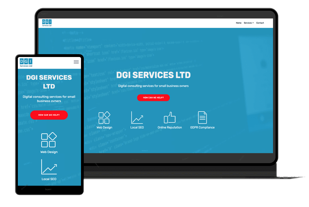
Digital Consulting Agency Website Design
Website Design
Client
- DGI Services Ltd
Services
- Web design
- Front End Development
- Back End Development
- Site Architecture
- UI / UX
- Logo Design
- Branding
- Website Build
- Server Setup
- SSL
- Email Server Setup
- Autoresponder Service
Deliverables
- PHP Website
- Illustrations
- Icons
- Company Logo
- PHP Build
- Autoresponder Service
- Email Campaigns
Other
- SEO
- Analytics
- Social Media
- Server Security
- Site Backup
- Website Maintenance
- Local Citations
- Content
Website

Project Info
Challenge
The first challenge in designing the website structure it was to highlight all four services provided right away, without any scrolling or slides on desktops and laptops.
The second challenge was to intercalate CTAs on every service page (one CTA for free offers and one for the listed service itself) in a non-intrusive manner for the site visitors.
The website as a whole must be user friendly and appealing. One important aspect is the feedback provided to each action taken by the user. For example, when a user subscribe to a mailing list, relevant feedback and further instructions must be provided. Moreover, payment integration with successful link protection was primordial. Cancellations and user retention after cancellations was another challenge to deal with.
Solution
For the first challenge I used a CTA linked to the services section in the homepage, and icons for each service bellow the CTA. This way, the visitors are made aware right away of the services offered and can find out what can be interesting to them by clicking the appropriate icon, or the CTA.
The solution for the second challenge was to keep the core offers format whilst differentiating the CTAs by colours and position.
To provide relevant feedback for each user action, I create special scripts and responses and integrate everything with the mailing provider with redirection to the relevant page containing further instructions. For successful payments, I redirected the user to a protected page whilst collecting these details during the payment process. To avoid losing customers, I redirected cancellations to a one-time low-price offer for the relevant cancelled service. This strategy works well, as anybody seems to be happy when offered a better deal.
